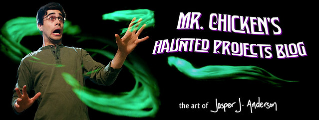
You may have noticed a change in the blog header graphics (or not, since there hasn't been terribly much going on here lately, so you probably don't even remember, right?). Here's the scoop:
1) The last header had lousy artwork that was really only meant to be a placeholder
2) "Yard Haunt" really has no business being in the title anymore, as we've just passed six years since the last one. They will return, but not in the foreseeable future.
So, there you go. New art. Well, graphics. Let's not over-inflate it, here.
Here's the evolution of the blog to date. A moment of silence, please, for those headers no longer with us.
Before that there was no picture, and it was another site!
Good riddance.
I've got some darned cool spooky projects cooking, so keep yer eyes peeled.
P.S. Hey, those new ghosts look neat, right? You can download a projection video of them here: www.chickenprops.com/p/spooks.html
Thursday, November 5, 2015
Subscribe to:
Post Comments (Atom)


Love the new banner! Very sharp and professional looking good font too. I check in often and did like the Don Knots one too, but this one is soooo much better! Keep up the great art and great project posts!
ReplyDeleteThanks Adam!
DeleteThe Don Knott's will always hold a spot in my heart but I understand the new graphics and I DO like the new banner
ReplyDeleteAlways looking for more to come!
Yeah, I couldn't bring myself to change my Don Knotts avatar for comments ;)
DeleteI like it, you really managed that Don Knotts gasp of abject cowardice, heh heh.
ReplyDeleteI also really like the new spooks. They look like great Haunted Mansion effects!
Thanks Mantan!
Delete